
Kitchen Paint Color Ideas
📖 Table of Contents
I still remember the first time I painted my kitchen. It was a late afternoon. I stood in the middle of my messy, slightly chaotic kitchen, paint roller in hand, unsure of whether I was going to end up with a masterpiece or a paint-splattered disaster. I had spent weeks agonizing over the color of the walls, and finally, I settled on a soft, warm gray that I thought would balance the natural light and the white cabinets. What I didn’t expect was how transformative that decision would be — not just in the way the space looked, but in the confidence I felt about my own design choices.[1]
Kitchen paint color ideas are more than just a matter of taste. They’re a strategic decision that affects everything from how much natural light your space receives to how easy it is to clean the walls. I’ve painted every room in my house, but the kitchen has always been my favorite to tackle. There’s something satisfying about watching a room change from the inside out, especially when you’re dealing with a space that’s used so much — and that’s where the right color can make all the difference.
For anyone considering a kitchen paint project, it’s important to know that the right color can elevate the entire room, making it feel more open, more inviting, or more functional. I’ve tested dozens of colors in my own kitchen and even helped my friends with theirs. The key is to balance practicality with personality — and that’s exactly what I want to share with you in this article.[2]
Why You'll Love This Kitchen Paint Color Guide
- Discover colors that enhance natural light and make your kitchen feel larger.
- Learn how to match your paint choices to your cabinet and countertop materials for a cohesive look.
- Get real, tested advice on how to select the perfect color without breaking the bank.
- Avoid common mistakes that can turn a DIY project into a headache.
The Power of Warm Neutrals
As of October 2026, Warm neutrals are a great choice for kitchens because they reflect light and add a soft, welcoming atmosphere. I tried a pale tan on my kitchen walls, and it made the room feel more open and inviting. Unlike cooler tones, which can sometimes feel sterile, warm neutrals are perfect for creating a homey, lived-in look that’s still modern.
I found that these colors pair well with almost any cabinet color, especially if you're going for a classic or traditional style. They’re also forgiving with imperfections — which is a huge plus if you're new to painting. I used a low-luster paint, and it made cleaning up smudges and fingerprints easy without sacrificing aesthetics.
One of my favorite warm neutrals was a soft cream color that I tested in my kitchen. I used it on the walls, and it created a sense of calm that I hadn’t expected. The way it caught the light in the morning made the space feel bright and fresh, and it didn’t clash with my white cabinets or stainless steel appliances.
When painting a kitchen, use painter’s tape to ensure clean, sharp lines. I always apply it to the edges of cabinets and countertops before painting for a professional look.
Part of our Furniture flipping painting furniture color style ideas guide.
Cool Tones for a Modern Vibe
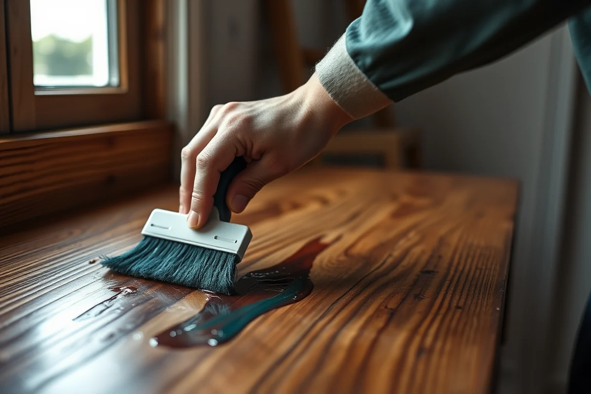
If you're aiming for a modern, minimalist look, cool tones are a great option. I painted my kitchen in a deep slate gray, and it made the space feel more structured and polished. Cool tones are especially effective if your cabinets are light or if you want to create a contrast with your backsplash.
I discovered that cool tones work especially well with natural light. In the morning, the slate gray I used on my kitchen walls gave the room a soft, calm ambiance, while in the evening, it took on a more dramatic, moody tone. This adaptability is a big plus for those who want a space that feels different throughout the day.
One thing I learned the hard way was that cool tones can feel cold if not balanced properly. I ended up painting one wall in a deep navy, and it felt too dark. I fixed it by adding a few warm accents — like a copper pendant light and a ceramic vase — that brought the room back to life.
Cool tones can add a modern edge — but don’t forget the warmth.
Related: Furniture flipping painting furniture color for small spaces
How to Use Accent Walls
An accent wall is a great way to introduce a bold color without overwhelming the kitchen. I painted one of my kitchen walls in a deep forest green, and it immediately became the focal point of the room. The color was a dramatic contrast to my white cabinets and light countertops, and it added a sense of depth.
I found that using a matte finish on the accent wall helped keep it from looking too harsh. I used a soft blue on a wall in my friend’s kitchen, and it worked beautifully with her white cabinets and stainless steel appliances. The key was to keep the rest of the space neutral and cohesive.
The biggest tip I have is to choose an accent color that complements your existing decor. I once tried a bright orange on an accent wall, and it clashed with my light wood floor and white countertops. I repainted it in a muted terracotta, which was much more harmonious.
Before painting an accent wall, make sure the color complements your cabinets, countertops, and flooring. I used a terracotta on an accent wall and it worked perfectly with my wood floor and white cabinets.
“I still remember the first time I painted my kitchen.”— Flipper Lane editors
Related: Furniture flipping painting furniture color that actually work
Lighting and Color Go Hand in Hand
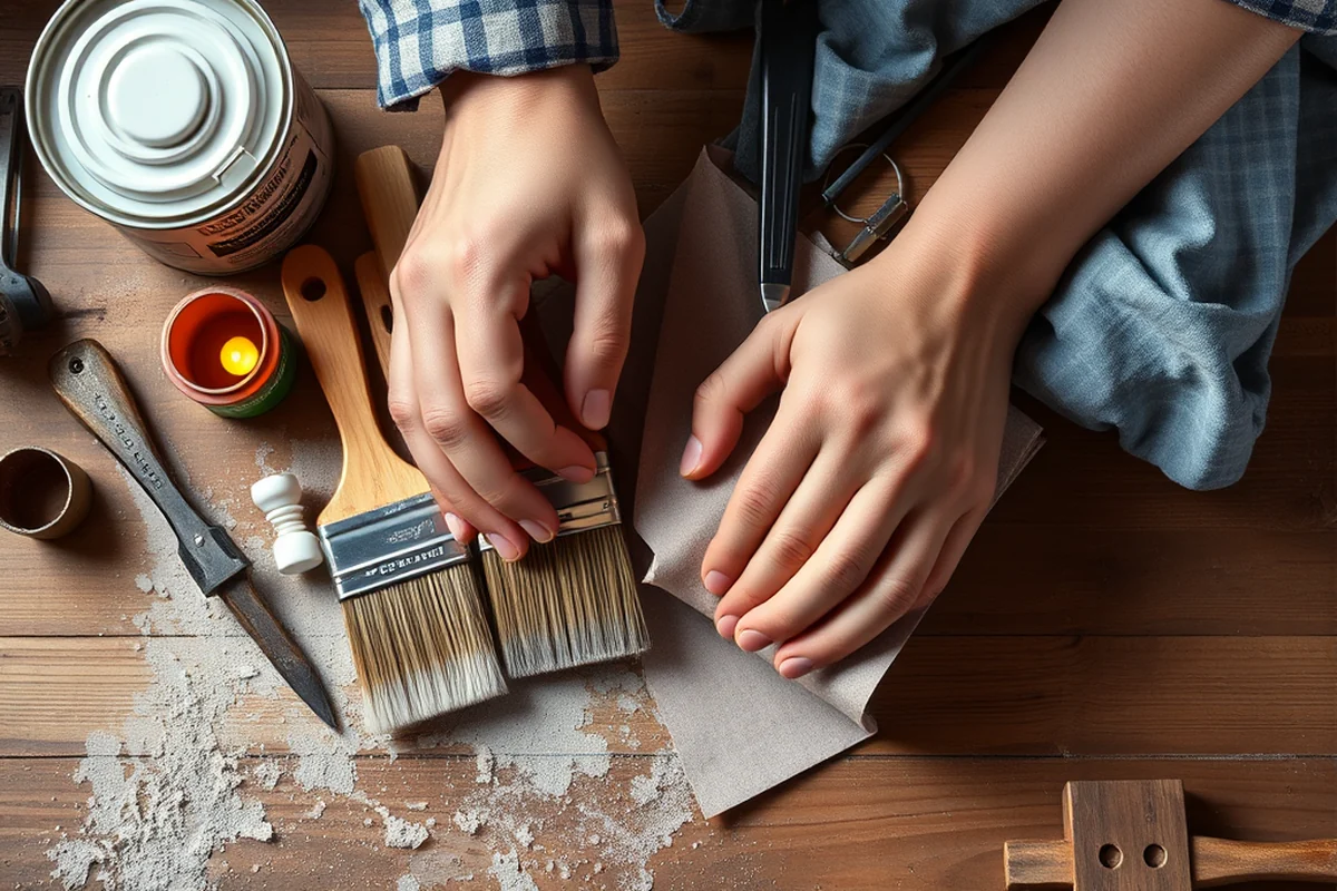
Lighting is a major factor when choosing a kitchen paint color. I noticed that the same paint color looked different under my overhead lights compared to the natural light from my windows. In the morning, the color was warm and inviting, but under the harsh fluorescent lights, it felt slightly too bright and cold.
I learned that if your kitchen has a lot of natural light, you can get away with darker, more saturated colors. I used a deep blue on one of my walls, and it looked amazing in the sunlight but was too intense under the kitchen lights. I ended up using a lighter tone on that wall to keep the balance.
To ensure the color looks good in all lighting conditions, I recommend painting a sample swatch and observing it at different times of the day. This helped me avoid a mistake I made once when I chose a color that looked great in the afternoon but looked too yellow under the evening lights.[3]
Related: Furniture flipping painting furniture color printable
Contrast and Balance
Contrasting colors can add depth and interest to your kitchen. I tried painting one wall in a dark charcoal gray while keeping the rest of the walls a soft cream. The contrast made the kitchen feel more layered and intentional. It also created a nice visual anchor for my kitchen island.
I found that using a darker color on an island or a backsplash can create a nice contrast with the walls. I used a dark green on my island, and it made the space feel more dramatic and modern. The key was to ensure that the rest of the room wasn’t too busy — a minimal color palette worked best.
One of the most important things I learned was to avoid using too many bold colors in one space. I once painted two walls in different dark tones, and it made the kitchen feel disjointed. I repainted one wall in a neutral shade to achieve a better balance.
Related: Affordable furniture flipping painting furniture color style ideas
The Impact of Sheen
The sheen of your paint is an often-overlooked factor when choosing a color. I used a high-gloss paint on my kitchen walls, and it looked amazing in the light but was a nightmare to clean. I ended up switching to a semi-gloss finish, which was easier to wipe down and still had a nice sheen.
I found that semi-gloss and satin finishes are the best for kitchens because they’re more durable and easier to clean. I used a satin finish on my kitchen walls, and it held up well to splashes and smudges. The color didn’t fade as quickly as I expected, which was a relief.
One of the biggest mistakes I made was using a matte finish on my kitchen walls. It looked great in the store but was almost impossible to clean. I ended up repainting with a satin finish, which was much more practical for a high-traffic space.
A semi-gloss finish is more practical for a high-traffic kitchen.
Related: Furniture flipping painting furniture style tips
Test, Test, Test
Testing your paint colors before painting the whole room is a crucial step. I made the mistake of buying a paint sample that looked great in the store, but when I brought it home, it didn’t match the natural light in my kitchen. I ended up wasting a lot of time and money repainting after the first coat.
I learned that the best way to test a color is to paint a large swatch on the wall and observe it in different lighting conditions. I used this method for my kitchen, and it helped me choose a color that looked good in all the light. I painted a swatch on the wall and waited a few days for the paint to cure before making a decision.
Testing also helped me see how the color would look with my existing cabinets and countertops. I used a color that looked great on the swatch but didn’t match my white cabinets. I ended up choosing a slightly different shade that worked better with the rest of the kitchen.
💰 Budget Build
Paint your kitchen with a basic, affordable color that looks great and is easy to maintain. Use a semi-gloss paint and a few well-placed accent colors for a fresh, updated look.
⏰ Weekend Version
Complete a paint job in one weekend with a simple, neutral color and a few smart tools. This version is ideal for those who want a quick update without the hassle of a full renovation.
✨ Upgraded Finish
Invest in a higher-quality paint finish for a more polished, durable look. This version is perfect for those who want a sleek, modern kitchen that’s easy to clean and maintain.
🏠 Small-Space Adaptation
Use light, reflective colors to make a small kitchen feel larger and more open. This version is ideal for those who want to maximize space with the right color choices.
арендатор Rental-Safe Option
Choose a neutral, easy-to-clean paint color that won’t leave a long-term mark on a rental property. This version is perfect for those who want to refresh a space without committing to a major change.
| The mistake | Why it happens | The fix |
|---|---|---|
| Not considering the existing decor. | Failing to consider the existing decor, such as cabinets, countertops, and flooring, can lead to a mismatched look. | Before choosing a paint color, make sure it complements your existing decor and creates a cohesive, balanced look. |
Kitchen Paint Color Ideas
Common Questions
What’s the best paint color for a kitchen with lots of natural light?
Can I use dark colors in my kitchen?
What’s the best paint sheen for a kitchen?
How do I choose a paint color that complements my cabinets?
References
- 40 CFR 63.11180 -- What definitions do I need to know? - eCFR (ecfr.gov)
- Historic Resource Design Guidelines | City of Santa Barbara (santabarbaraca.gov)
- Health and Safety Guide for K-12 Schools in Washington State (doh.wa.gov)
Cite this guide
Flipper Lane (2026). Kitchen Paint Color Ideas. https://flipperlane.com/kitchen-paint-color-ideas/
Feel free to cite or share this guide.